

Don't miss ADWEEK House at Cannes, June 16-19. Join us as we celebrate our 45th anniversary and explore the industry's now and next. RSVP.
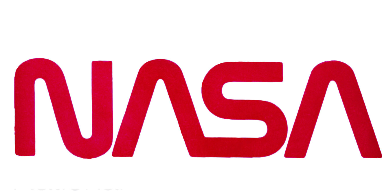
NASA’s Worm is being revived to adorn the side of the Falcon 9 rocket, instead of its usual Meatball.
If that sentence makes no sense to you, you’re not alone. But you’ve undoubtedly seen both The Worm and The Meatball on merchandise everywhere.
The space program’s typographic logo, known as “The Worm,” will appear on the SpaceX-built rocket Falcon 9 as it sets off for the International Space Station in late May—despite the fact that the logo was officially killed off by the agency in 1992.
Also known as the NASA Logotype Insignia, The Worm was designed by Richard Danne and Bruce Blackburn of the New York firm Danne & Blackburn in 1975.
NASA’s official logotype, known as “The Meatball,” shows a blue sphere (representing a planet) ornamented with a red chevron (representing aeronautics), white stars (representing space) and an orbiting spacecraft (representing space travel).

WORK SMARTER - LEARN, GROW AND BE INSPIRED.
Subscribe today!
To Read the Full Story Become an Adweek+ Subscriber
Already a member? Sign in