Inspiration meets innovation at Brandweek, the ultimate marketing experience. Join industry luminaries, rising talent and strategic experts in Phoenix, Arizona this September 23–26 to assess challenges, develop solutions and create new pathways for growth. Register early to save.
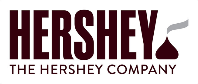
The Internet has been buzzing about Hershey’s new logo, and not necessarily in a good way. The redesign is a key part of the 120-year-old company’s wider rebranding efforts.
In an effort to expand its identity beyond just chocolate bars and to attract a broader customer base, The Hershey Company is moving away from the 3-D styling of its old logo to a simpler and more modern flat design.
But the brand's new emblem has been the brunt of many jokes on social media because of its striking resemblence to a popular emoji.

WORK SMARTER - LEARN, GROW AND BE INSPIRED.
Subscribe today!
To Read the Full Story Become an Adweek+ Subscriber
Already a member? Sign in

