Be among trailblazing marketing pros at Brandweek this September 23–26 in Phoenix, Arizona. Experience incredible networking, insightful sessions and a boost of inspiration at ADWEEK’s ultimate brand event. Register by May 13 to save 35%.
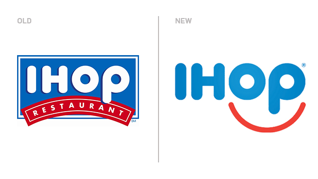
Despite being nearly 60 years old, IHOP has repeatedly proven itself well adapted to the social media age. And now the chain has a new logo to reflect its Twitter-savvy persona.
The new logo, redesigned for the first time in more than 20 years, casts the O and P into a smiley face and drops the blue and red framing long found around the lettering.
"Our guests have told us for many years that coming to IHOP, and in many cases just thinking about our world famous pancakes, makes them smile," marketing vp Kirk Thompson said in a statement.

WORK SMARTER - LEARN, GROW AND BE INSPIRED.
Subscribe today!
To Read the Full Story Become an Adweek+ Subscriber
Already a member? Sign in

