
Inspiration meets innovation at Brandweek, the ultimate marketing experience. Join industry luminaries, rising talent and strategic experts in Phoenix, Arizona this September 23–26 to assess challenges, develop solutions and create new pathways for growth. Register early to save.
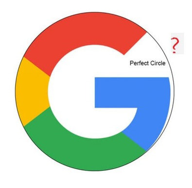
Designers already know all this, but a recent question posed on Reddit about the dimensions of Google’s “G” logo—and why it’s not a perfect circle—led to a crash course in a few fundamentals of graphic design.

WORK SMARTER - LEARN, GROW AND BE INSPIRED.
Subscribe today!
To Read the Full Story Become an Adweek+ Subscriber
Already a member? Sign in