
Be among trailblazing marketing pros at Brandweek this September 23–26 in Phoenix, Arizona. Experience incredible networking, insightful sessions and a boost of inspiration at ADWEEK’s ultimate brand event. Register by May 13 to save 35%.
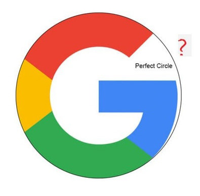
Designers already know all this, but a recent question posed on Reddit about the dimensions of Google’s “G” logo—and why it’s not a perfect circle—led to a crash course in a few fundamentals of graphic design.

WORK SMARTER - LEARN, GROW AND BE INSPIRED.
Subscribe today!
To Read the Full Story Become an Adweek+ Subscriber
Already a member? Sign in