Be among trailblazing marketing pros at Brandweek this September 23–26 in Phoenix, Arizona. Experience incredible networking, insightful sessions and a boost of inspiration at ADWEEK’s ultimate brand event. Register by May 13 to save 35%.
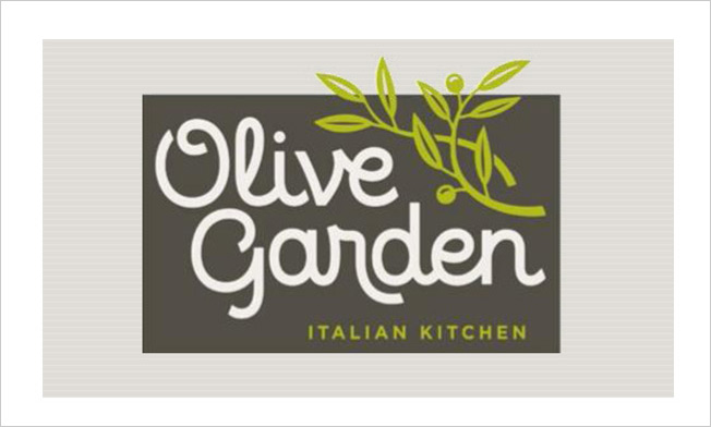
If you thought Olive Garden's logo couldn't get any worse, you were wrong.
On Monday, the Darden-owned restaurant chain unveiled a brand refresh. The perplexing cluster of grapes that graced Olive Garden's logo for a decade and a half has devolved into a twiggy branch that appears to be an unfortunate shade of chartreuse. The previous tacky pseudo-script laying out the chain's name has become a font that's even more half-baked.
The early feedback is not good.

WORK SMARTER - LEARN, GROW AND BE INSPIRED.
Subscribe today!
To Read the Full Story Become an Adweek+ Subscriber
Already a member? Sign in

