Inspiration meets innovation at Brandweek, the ultimate marketing experience. Join industry luminaries, rising talent and strategic experts in Phoenix, Arizona this September 23–26 to assess challenges, develop solutions and create new pathways for growth. Register early to save.
Now that Google and Verizon have sparked global design debates by redesigning their logos, it makes sense to ask who should be next.
I mean, other than Yahoo.
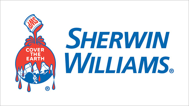
Looking beyond the tech and telecom megacorporations, there’s one classic brand logo that nearly every designer—or human with eyes—would like to see reworked: Sherwin-Williams.
The paint brand’s “Cover the Earth” logo infamously shows red paint being poured across our planet’s verdant surface and teeming seas, with the titanic droplets defying gravity itself to drip further into the solar system.

WORK SMARTER - LEARN, GROW AND BE INSPIRED.
Subscribe today!
To Read the Full Story Become an Adweek+ Subscriber
Already a member? Sign in

