Be among trailblazing marketing pros at Brandweek this September 23–26 in Phoenix, Arizona. Experience incredible networking, insightful sessions and a boost of inspiration at ADWEEK’s ultimate brand event. Register by May 13 to save 35%.
Anyone who's played squash knows it's a frenetic game. Now, one British squash club has a fascinating new logo to match.
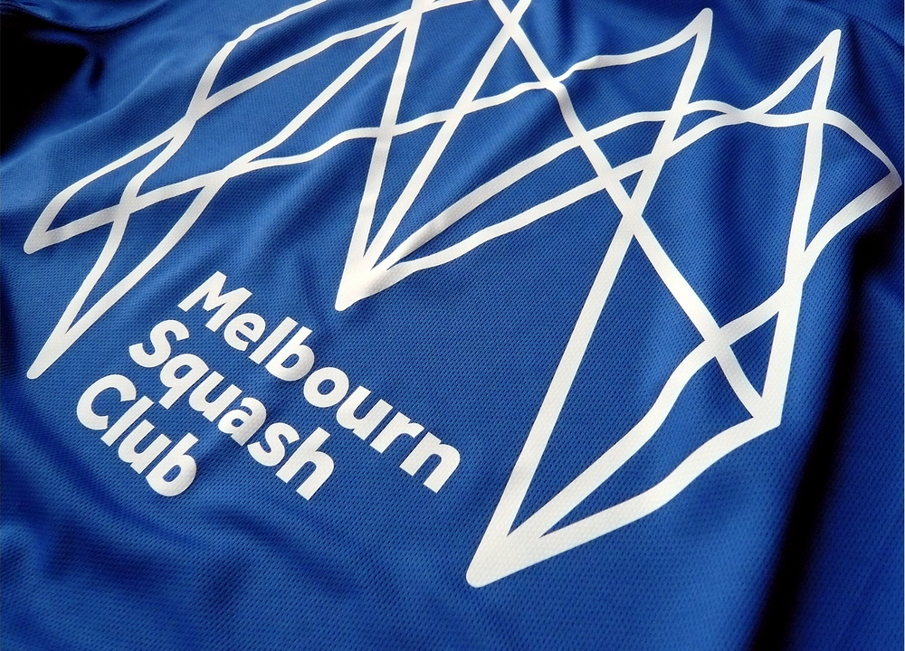
Melbourn Squash Club's new branding features a web of zigzag lines designed to look like a capital "M." Created by Distil Studios, it's meant to capture the spirit of smacking a ball back and forth against a wall with a racket.
The design studio explains on its site: "Avoiding generic silhouettes of players or two crossed rackets, our inspiration comes from every thwack, thud, squeak and sneaky drop shot to form their unique club initial."
Distil creative director Neil Hedger tells Logo Design Love that the original sketch was pretty complex, and that the agency tried to simplify it—but in the end, couldn't.

WORK SMARTER - LEARN, GROW AND BE INSPIRED.
Subscribe today!
To Read the Full Story Become an Adweek+ Subscriber
Already a member? Sign in

