Inspiration meets innovation at Brandweek, the ultimate marketing experience. Join industry luminaries, rising talent and strategic experts in Phoenix, Arizona this September 23–26 to assess challenges, develop solutions and create new pathways for growth. Register early to save.
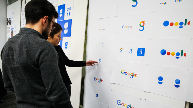
Yesterday, Google introduced the world to its new visual identity, a serif-free logo and colorful interactive icons. The new look and feel—the brand's attempt to make interacting with Google on its various platforms a seamless experience—has received mixed reviews.
In fact, Twitter users seem convinced that Google's new crooked—or smiling—"e" rips off Heineken's logo. Google admitted as much, citing Heineken as an inspiration, and the beer brand had a cheeky response.
Geïnspireerd door de meester. /cc: @heineken_NL pic.twitter.com/RhBMko6Qrl

WORK SMARTER - LEARN, GROW AND BE INSPIRED.
Subscribe today!
To Read the Full Story Become an Adweek+ Subscriber
Already a member? Sign in

