Inspiration meets innovation at Brandweek, the ultimate marketing experience. Join industry luminaries, rising talent and strategic experts in Phoenix, Arizona this September 23–26 to assess challenges, develop solutions and create new pathways for growth. Register early to save.
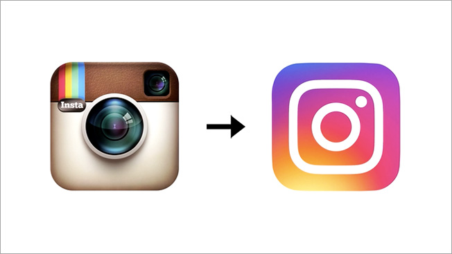
Instagram unveiled a new logo Wednesday, and it may well go down as one of the biggest design fails of the year.
The brand's famous skeuomorphic icon, a virtual representation of a physical camera, was beloved almost universally, and is one of the most instantly recognizable logos in tech. For some reason, Instagram felt it was dated. It was "beginning to feel, well… not reflective of the community, and we thought we could make it better," Ian Spalter, head of design at Instagram, writes in a Medium post (which also goes into its new, broader visual identity).

WORK SMARTER - LEARN, GROW AND BE INSPIRED.
Subscribe today!
To Read the Full Story Become an Adweek+ Subscriber
Already a member? Sign in

