Be among trailblazing marketing pros at Brandweek this September 23–26 in Phoenix, Arizona. Experience incredible networking, insightful sessions and a boost of inspiration at ADWEEK’s ultimate brand event. Register by May 13 to save 35%.
Best Western International is checking out, and Best Western Hotels & Resorts is checking in.
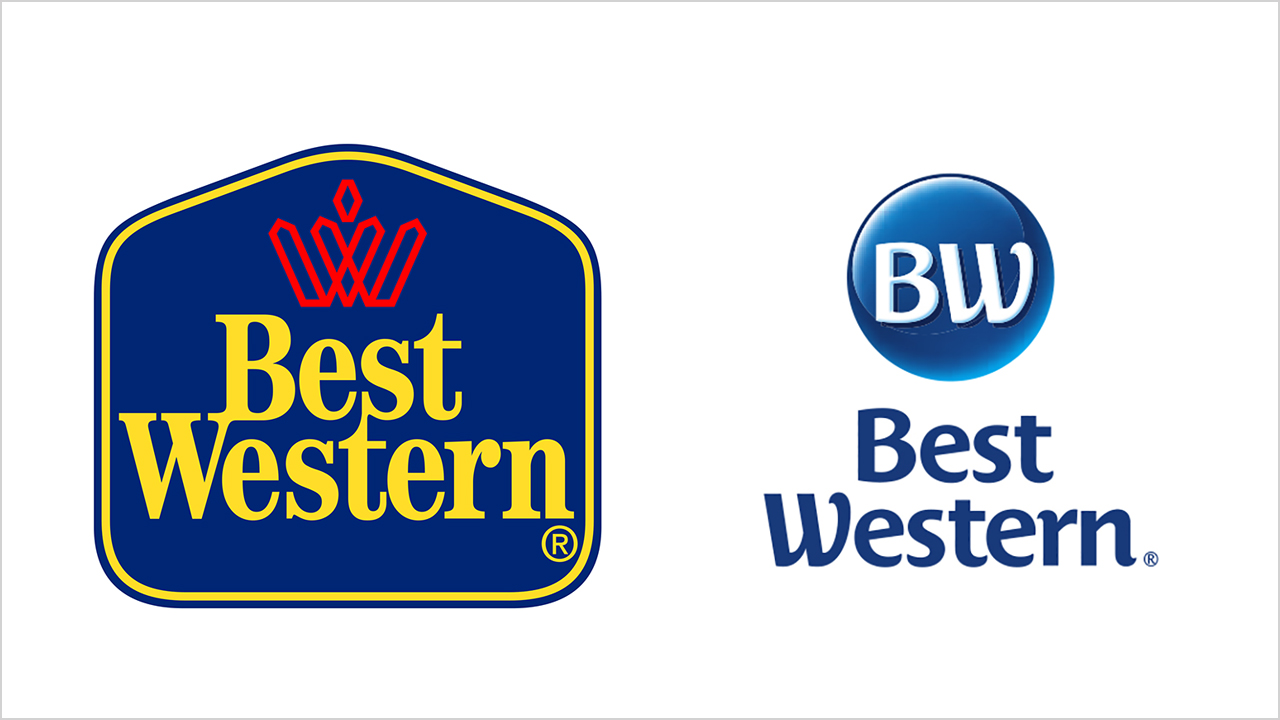
Along with tweaking its name this week, the 69-year-old hotel chain, which operates more than 4,100 properties in 100 countries, scrapped its familiar blue-and-gold logo in favor of different visual markers for its primary range of properties.
This wide-ranging brand reboot is part of a drive to help contemporize Best Western's image and broaden its appeal, particularly among millennials, in an increasingly complex and competitive marketplace.

WORK SMARTER - LEARN, GROW AND BE INSPIRED.
Subscribe today!
To Read the Full Story Become an Adweek+ Subscriber
Already a member? Sign in

