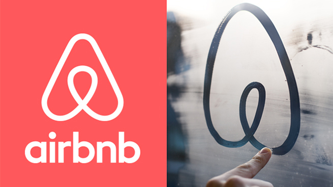
What appeared to be a run-of-the-mill rebranding story yesterday with Airbnb has taken a strange turn toward either memories of elementary school anatomy/sex-ed class or pre-Giuliani Times Square. Indeed, the Internet had a lot of fun with what the two b's in the brand might actually stand for.
The digital home renting service unveiled a new logo called Belo on Wednesday that generated considerable blogosphere chatter around whether the mark looked like female or male private parts.

WORK SMARTER - LEARN, GROW AND BE INSPIRED.
Subscribe today!
To Read the Full Story Become an Adweek+ Subscriber
Already a member? Sign in

