Inspiration meets innovation at Brandweek, the ultimate marketing experience. Join industry luminaries, rising talent and strategic experts in Phoenix, Arizona this September 23–26 to assess challenges, develop solutions and create new pathways for growth. Register early to save.
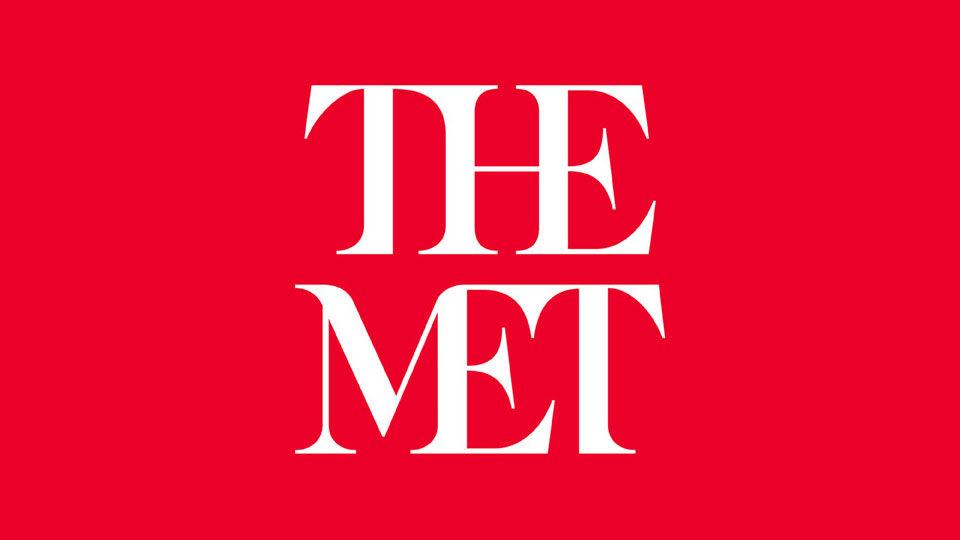
The Metropolitan Museum of Art has done away with the beautiful da Vinci-inspired logo it's used since 1971 in favor of … a double-stacked word mark made in kerning hell.
Vulture calls the update a "typographic bus crash," noting that "the whole ensemble looks like a red double-decker bus that has stopped short, shoving the passengers into each other's backs. Worse, the entire top half of the new logo consists of the word 'the.'"
Other commentators are referring to it as "Times New Rotten."

WORK SMARTER - LEARN, GROW AND BE INSPIRED.
Subscribe today!
To Read the Full Story Become an Adweek+ Subscriber
Already a member? Sign in

