Inspiration meets innovation at Brandweek, the ultimate marketing experience. Join industry luminaries, rising talent and strategic experts in Phoenix, Arizona this September 23–26 to assess challenges, develop solutions and create new pathways for growth. Register early to save.
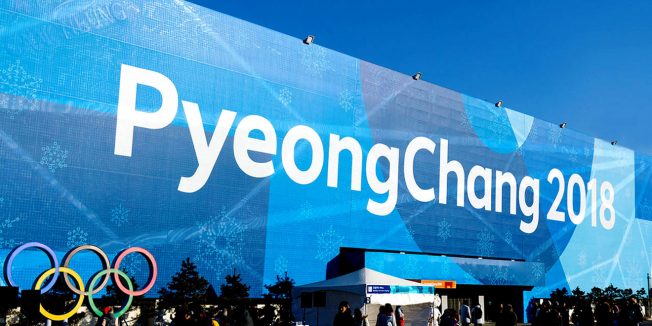
Branding the Olympics for a global audience is one of the world’s most high-profile design projects. For the 2018 Winter Games in PyeongChang, South Korea, the task fell to Interbrand, the global brand consultancy. And its work has been unique indeed—largely because, for the first time, the visual designs were built largely from words and letters.
The visual look of the PyeongChang Olympics is based on letters from Hangul, the Korean alphabet, which was created in the 15th century by Sejong the Great, the fourth king of Joseon-dynasty Korea.

WORK SMARTER - LEARN, GROW AND BE INSPIRED.
Subscribe today!
To Read the Full Story Become an Adweek+ Subscriber
Already a member? Sign in

