Inspiration meets innovation at Brandweek, the ultimate marketing experience. Join industry luminaries, rising talent and strategic experts in Phoenix, Arizona this September 23–26 to assess challenges, develop solutions and create new pathways for growth. Register early to save.
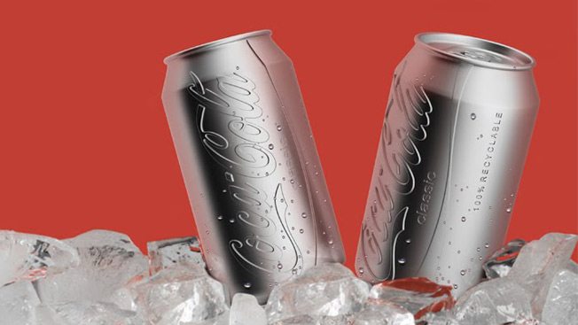
Most spec redesigns of classic brand logos aren't that great, so I cringed when I saw that someone was putting a new spin on Coca-Cola cans. Turns out I underestimated Ryan Harc, whose colorless can with a convex logo pressed right into the aluminum is pretty snazzy.
This apparently might be more eco-friendly than painting the cans, as it could reduce energy use and pollution in both the production and recycling processes. Plus, it looks like it was dispensed from a vending machine in The Bourne Identity, which is a good thing.

WORK SMARTER - LEARN, GROW AND BE INSPIRED.
Subscribe today!
To Read the Full Story Become an Adweek+ Subscriber
Already a member? Sign in

