Inspiration meets innovation at Brandweek, the ultimate marketing experience. Join industry luminaries, rising talent and strategic experts in Phoenix, Arizona this September 23–26 to assess challenges, develop solutions and create new pathways for growth. Register early to save.
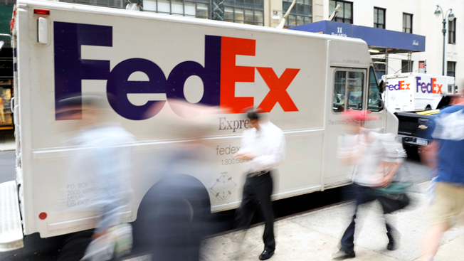
FedEx has a highly recognizable, iconic logo, but the color scheme across the company's many business divisions varied—until now. Today, FedEx announced that it's consolidating its look by turning all of its logos purple and orange.
The simplified visual identity was created after FedEx's research showed that purple and orange is one of the most recognized representations of the logo by consumers, according to Patrick Fitzgerald, svp of integrated marketing at FedEx.
"For more than 43 years, the logo has built up equity for our brand, on packaging, aircraft and drop boxes.

WORK SMARTER - LEARN, GROW AND BE INSPIRED.
Subscribe today!
To Read the Full Story Become an Adweek+ Subscriber
Already a member? Sign in

