

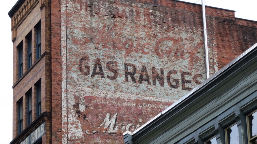
Take a walk through any city, and you’ll spot bygone advertising on buildings, walls and in alleys. Usually, you’ll come across it when a building’s outer wall sees sunlight for the first time in decades when a building next door gets torn down. It might be the name of the hardware store that used to be there, or hotel, or seafood restaurant, or restaurant near a hotel.

Before the giant billboards littering highways telling you to turn off at the next exit for a burger or ads wrapping around city buses informing you of the latest movie, old timey signs, formally called ghost signs, were once brightly painted, crisply lettered, illustrative advertisements for products, goods and services. But years of hiding and neglect can turn them into a whisper or a faint memory, and there’s some debate among artists and designers about whether to restore them or let them fade away.
Over time, these works of art have survived urban growth and development, as well as the elements, among other hardships. Less fortunate ghost signs crumble during demolition, layers of brick that served as their canvas reduced to rubble. But as the old continues to make way for the new, how much time do ghost signs have left? When they disappear, do we even notice?
Ghost signs: a primer
Faythe Levine, who wrote the book Sign Painters in 2012 and co-directed a documentary of the same title, calls sign painters the designers of their era. “They were the ad agency,” Levine told Adweek. These “wall dogs” and “snappers”—slang for sign painters—painted words and logos, and even striped gymnasium floors, according to Levine. From the 1930s to the 1950s, sign painters produced a majority of the large-scale graphics and some have lasted for close to a century because of the lead paint they used, Levine said. But the signs are fading away.
Thanks to the internet, you can still see ghost signs on social media and blogs before they disappear forever. Designer and author Nikki Villagomez began researching ghost signs in 2011, religiously posting on her blog. Her 2015 book Culture + Typography is a love letter to murals, manhole covers, neon, graffiti and ghost signs. She’s spotted ghost signs promoting local businesses, but she’s found big-name brands too, including Coca-Cola, Quaker and Nabisco (Uneeda Biscuit) in different cities across the country.
Villagomez continues to document ghost signs, spending hours walking and photographing outside of her full-time job. To those who see ghost signs as relics—old advertising from olden days—Villagomez suggests looking deeper and recognizing how important they are to the city and its identity.
“They’re almost everywhere,” Villagomez told Adweek, referencing ghost signs in older cities such as Charleston, S.C., and Savannah, Ga., “and are a way to embrace history.”
Ghost signs, oftentimes painted, could also be tiled or neon, as Villagomez writes in her book. But no matter the medium, standing the test of time qualifies it as a ghost sign. Faint and hard to see, chipped away and roughed up, the painted ones grab our attention, maybe more so than the brand-new because of just how tactile, and fragile, they are.
Villagomez has observed that some cities, like Charlotte, N.C., where she lives, have far fewer ghost signs. She might photograph a sign, and a month later, it’s been torn down or painted over.
Connecting generations
Painting over ghost signs not only erases the art but, Villagomez said, upsets people, since the sign is part of each city’s unique and individual character. “These signs were at their height in the early- to mid-1900s,” she said, concurrent with the debut of and popularity of neon signs.
But unlike neon, ghost signs have a human touch. They speak to—and for—people, which might have something to do with efforts to restore them to their pre-ghost days.
Take the world’s most recognizable brand, for example. Coca-Cola has not only taken steps to restore old signs, but it also has a manual for artists to follow when doing so. When creating new murals or restoring old ones, artists consult Designs for Painted Walls and Bulletins, which outlines standard Coca-Cola wall signs and specifications.
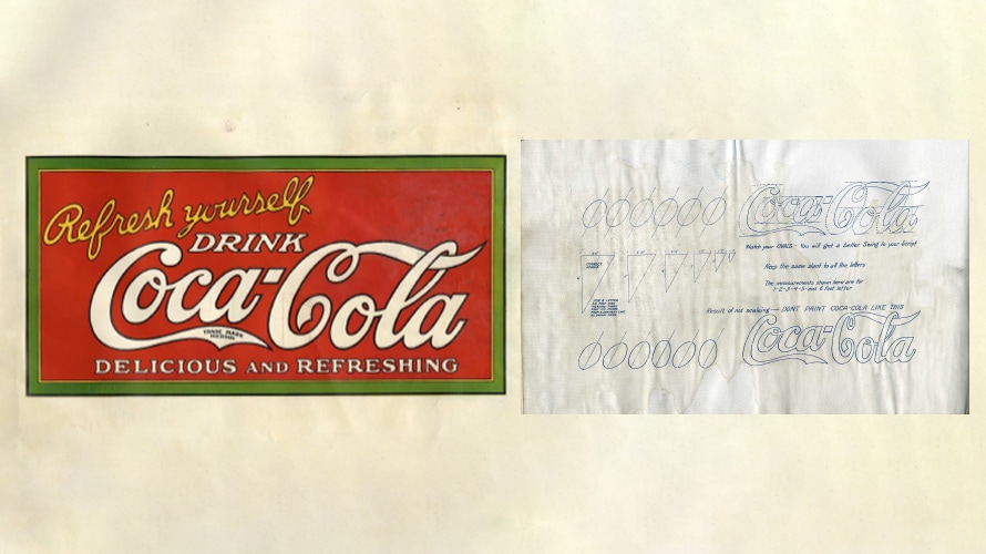
The guidebook provides directions for mixing colors, sizing guidelines and lettering details such as the proper way to paint the Coca-Cola script. There’s a right way and a wrong way to paint your ovals that make up the Coca-Cola logotype, and when done correctly, it brings “swing to your script,” as the guidelines promise. For design, color, lettering and typography fans, the manual provides a whole new way to “Enjoy Coke.”

Amber Thompson has completed a total of four murals for Coca-Cola in North Carolina and one in Atlanta. In all, two were painted from scratch, and those in Statesville, Cherryville and Uptown Charlotte, N.C., were done as restorations. Thompson spoke with Adweek about the importance of Coca-Cola’s Designs for Painted Walls and Bulletins and how it informs her process.
“The booklet is a helpful tool when it comes to making patterns that I use to transfer the designs onto the wall,” Thompson said. “I’m able to take an image and project it onto paper in order to create my patterns. It’s also really helpful in the event that I need to mix colors of paint. It gives the exact ratios of paints needed to mix a color for an area of the painting, similar to a paint-by-number painting.”
Thompson enjoys the work and calls herself a muralist, but when it comes to old-fashioned titles, she’ll go by sign painter, a title her grandfather, Andy Thompson, used to hold. He painted signs for Coca-Cola and taught his granddaughter everything he knew. “My grandfather passed away in 2017, which is how and when the torch got passed to me to continue work with Coca-Cola,” she said. Two of her murals sit alongside her grandfather’s art. The original signs and the new signs connect one generation of artists to another.
Should it stay or should we restore?
Tobias Frere-Jones, an award-winning type designer, has traveled the globe lecturing about fonts and typography. During his travels over two decades, he’s spotted ghost signs in London, Berlin, Copenhagen, New York and San Francisco, among other places. “Ghost signs exist everywhere,” Frere-Jones told Adweek, “and it’s a matter of being aware of the city.”
Unlike Villagomez, Frere-Jones doesn’t make it his mission to find ghost signs, but he does make a note of them and enjoys studying them. “I try to decipher them, and if a piece of signage is barely legible, I’ll still try to figure it out, what it used to say,” Frere-Jones said.
If they are too hard to read and in utter decay, Frere-Jones said, repairing and reviving the signs through restoration has its problems. “Don’t try to recreate them,” he said. “Stylistically, it’s a step backwards. It messes with the chronology, makes the past seem as if it was the present, and I think that’s missing the point.”
Frere-Jones cites one particular instance on Atlantic Avenue in Brooklyn. A ghost sign had been repainted on the John Curtain facade “quite well”—you can see it on Google Maps—but Frere-Jones called the results “strange and unnecessary.”

Frere-Jones feels strongly that ghost signs, even the smallest of fragments, should be left alone, without any restoration or repainting, to provide a richer and more accurate sense of time and place. “I’m glad they’re recognized as valuable aspects of the streetscape, but to really understand them and to preserve them, do not add anything to them,” he said.
Here today, here tomorrow
Restoring the old signs and murals by repainting and touching them up, while well intended, might do nothing more than create Frankensigns. The old, decaying art and advertising with restorative fresh coats of paint could make it look and feel new, but to Frere-Jones and others, making something old new again doesn’t feel quite right. Maybe, like Frankenstein’s monster, ghost signs shouldn’t come back from the dead—or near dead—as repainted signs.
Villagomez, however, disagrees. “Restoring old signs,” she said, “bringing them back to their natural glory, is a wonderful way to honor the history that they represent.”
Sign painters, muralists and artists like Mike Wirth also see value in preservation through restoration. For Wirth, the paint is just as important as the emotional connection. When Wirth read about Thompson and her grandfather and their collaborative work for Coca-Cola, he felt something special in his heart.
“I have two daughters who are showing signs of independent creative expression, and a dream of mine is to have them with me up on a scissor lift painting a wall side-by-side,” Wirth told Adweek. “Ultimately, I want them to find a career in the arts and have murals as one of their pathways.”


