Inspiration meets innovation at Brandweek, the ultimate marketing experience. Join industry luminaries, rising talent and strategic experts in Phoenix, Arizona this September 23–26 to assess challenges, develop solutions and create new pathways for growth. Register early to save.
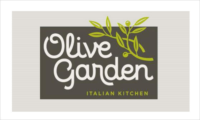
If you thought Olive Garden's logo couldn't get any worse, you were wrong.
On Monday, the Darden-owned restaurant chain unveiled a brand refresh. The perplexing cluster of grapes that graced Olive Garden's logo for a decade and a half has devolved into a twiggy branch that appears to be an unfortunate shade of chartreuse. The previous tacky pseudo-script laying out the chain's name has become a font that's even more half-baked.
The early feedback is not good.

WORK SMARTER - LEARN, GROW AND BE INSPIRED.
Subscribe today!
To Read the Full Story Become an Adweek+ Subscriber
Already a member? Sign in

