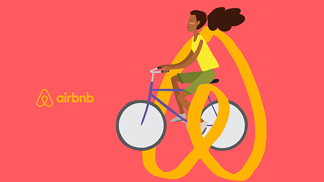
Airbnb, which facilitates brief home rentals in 190 countries, has unveiled a new logo and site redesign this afternoon as the brand wants to achieve more of a global appeal.
To some, the logo/trademark looks like a playful, upside-down heart, which the San Francisco-based digital company dubbed "Belo"—operating under the premise that travelers enjoy bed-and-breakfast-styled accommodations over a hotel because they make people feel as if they belong in a local sense. It will appear in a variety of colors, and Airbnb users are invited to personalize the mark with creativity of their own.

WORK SMARTER - LEARN, GROW AND BE INSPIRED.
Subscribe today!
To Read the Full Story Become an Adweek+ Subscriber
Already a member? Sign in

