Inspiration meets innovation at Brandweek, the ultimate marketing experience. Join industry luminaries, rising talent and strategic experts in Phoenix, Arizona this September 23–26 to assess challenges, develop solutions and create new pathways for growth. Register early to save.
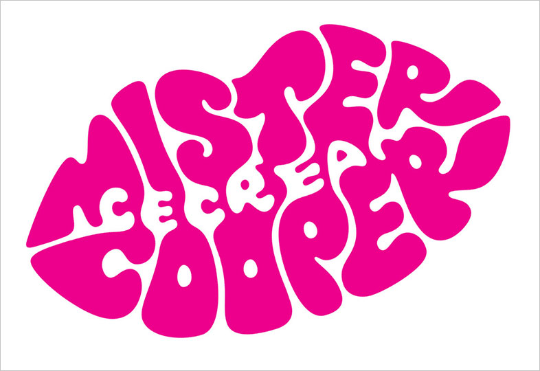
The process of logo design is pretty intriguing, particularly when a designer takes you step by step through the development of a mark. The video below is a great example, as Kath Tudball of design firm Johnson Banks explains the creation of a gourmet ice cream startup called Mr. Cooper.
The logo uses negative space to great effect, and also has a nice drippy quality that fits the brand well. But the mark you see above was the end point of a very involved process, which Tudball shows in great detail.
The video is longish, but worth it.

WORK SMARTER - LEARN, GROW AND BE INSPIRED.
Subscribe today!
To Read the Full Story Become an Adweek+ Subscriber
Already a member? Sign in

