Inspiration meets innovation at Brandweek, the ultimate marketing experience. Join industry luminaries, rising talent and strategic experts in Phoenix, Arizona this September 23–26 to assess challenges, develop solutions and create new pathways for growth. Register early to save.
Best Western International is checking out, and Best Western Hotels & Resorts is checking in.
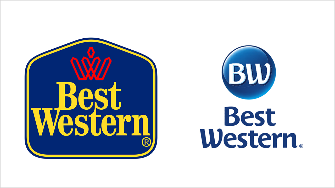
Along with tweaking its name this week, the 69-year-old hotel chain, which operates more than 4,100 properties in 100 countries, scrapped its familiar blue-and-gold logo in favor of different visual markers for its primary range of properties.
This wide-ranging brand reboot is part of a drive to help contemporize Best Western's image and broaden its appeal, particularly among millennials, in an increasingly complex and competitive marketplace.

WORK SMARTER - LEARN, GROW AND BE INSPIRED.
Subscribe today!
To Read the Full Story Become an Adweek+ Subscriber
Already a member? Sign in

