Inspiration meets innovation at Brandweek, the ultimate marketing experience. Join industry luminaries, rising talent and strategic experts in Phoenix, Arizona this September 23–26 to assess challenges, develop solutions and create new pathways for growth. Register early to save.
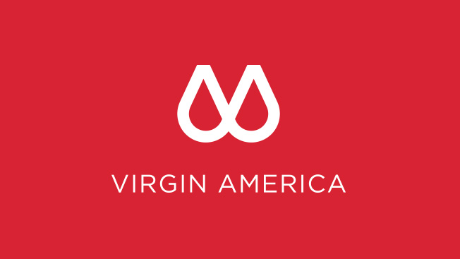
Is Virgin America making fun of Airbnb a year and a half after the latter's infamous logo redesign? It's quite possible. The airline's own apparently new design looks like, well, a pair of breasts. Airbnb's famously resembled a vagina.
Per the company's release, the logo comes from creative shop N_Fuzion (which isn't real). "The two prominently displayed half circles," it says, "represent our tech-forward innovation on the one hand—and our supportive approach to guest care on the other."

WORK SMARTER - LEARN, GROW AND BE INSPIRED.
Subscribe today!
To Read the Full Story Become an Adweek+ Subscriber
Already a member? Sign in

