Inspiration meets innovation at Brandweek, the ultimate marketing experience. Join industry luminaries, rising talent and strategic experts in Phoenix, Arizona this September 23–26 to assess challenges, develop solutions and create new pathways for growth. Register early to save.
You didn't notice it, but the design geeks on Reddit did.
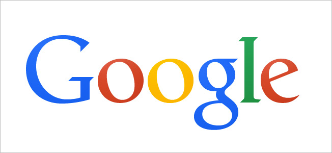
Google moved the "g" right one pixel and the "l" down and right one pixel, one eagle-eyed Redditor noticed on Sunday. Apparently, this was done to fix a very slight problem with the kerning of the letters. As another Redditor pointed out: "The bottom of the 'l' and 'e' did not line up horizontally and that, my friend, must have driven some design employee crazy."

WORK SMARTER - LEARN, GROW AND BE INSPIRED.
Subscribe today!
To Read the Full Story Become an Adweek+ Subscriber
Already a member? Sign in

